
Thursday, October 14, 2010
Monday, September 27, 2010

Monday, September 20, 2010

Monday, August 23, 2010
Computer Graphics Photoshop Magazine Cover Project


This was my magazine project. The original picture was taken by me at the top of a ferris wheel at Atlantic City. I used drop shadows and glow effects around the text; and also used the liquify effect in photoshop to create the "creepy" buildings in the background. My flying saucer font was from a website I found. I kept going back to this project from beginning to almost end of the course, just because it still was not perfect. Since I would like to pursue magazine layout, etc., it was important to me to get it right for my own satisfaction and to know I could make it "perfect". Even though it took me a few times in between other assignments, I am very pleased and proud of the outcome....now I can sleep!.....
Saturday, August 21, 2010


Computer Graphics Photoshop Cherokee Jewelry Website Project
 This was our website project. I found this project at first to be a little challenging because I had never created a website page before. I used this beautiful photo to start. Once I got the hang of the "grids", I ended up with this very colorful website. I used photos of feathers, drums, etc. to create the heading and buttons. I tried to use fonts, i.e., Playbill, to give the feel of the indian heritage. The soft colors in the photo were nice but I also like the brighter colors I used in the layers of the website.
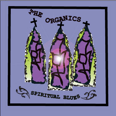
Computer Graphics Adobe Illustrator Architecture Project AFA Chapel


This is a picture of the Air Force Academy Chapel in Colorado. This photo was at dusk so it was important for me to use gradients and effects that reflected the time of day. This Chapel was completed in 1962. The architect was Walter Netsch. It was regarded as modernist architecture and was originally controversial for its design. It is very beautiful inside with its spires filled with mosaic color glass and triangular clear aluminum panels.
Wednesday, July 28, 2010


Tuesday, July 27, 2010


Monday, July 26, 2010


Sunday, June 27, 2010


Saturday, June 26, 2010


Computer Graphics Adobe Illustrator Team Logo Project


This logo project was a team effort. I wanted to show a little history behind the creation so I included the first free hand drawing that I did with the owl, fork and glass together in which I presented to the rest of the team. The team liked the wine glass idea and that's how it got started. We chose this image to reflect the company’s focus to provide education about wine and also wine and food pairings in a social and fun setting. This is why we decided our image should have multiple wine glasses. The color we chose, obviously, reflects the beautiful color of the burgundy wine. The opacity of the two glasses in the logo’s background was reduced to suggest a three dimensional appeal. The border provides a finishing touch to the business cards. Finally, we chose the font, Bernard Fashion BT, to express a classy, modern and sophisticated feel to the logo’s overall appearance. We used black for the font color to also convey this sophistication. The logo works well in black and white as well as the two colors.
Wednesday, June 23, 2010


Subscribe to:
Comments (Atom)